We take for granted a lot about neutral colors: We might expect they are tones without much color, including whites, creams, beiges, and grays, that they are a necessary backdrop for the brighter elements in interior decor, and that they’re intentionally unremarkable. We might choose a neutral color thinking it will have universal appeal for the house we are preparing for market or choose a neutral to play it “safe” with a tone we think we won’t tire of seeing day after day But — and here’s the catch — “nondescript,” “safe,” and “unremarkable” can otherwise be known as “boring.”
However, the neutrals we’ve been used to are changing. There’s a growing consensus among new designs and interior decor trends that neutrals needn’t be colorless — and this fresh take on neutral is anything but boring.
The key is to approach your use of neutrals as a color to set the stage for the rest of your interior decor. Did you notice we said color?
Let’s take a look at some of the newest colors being used as neutrals in ceramic tile and interior decor.
Warm Neutrals
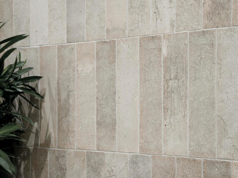
Neutrals with warm undertones are growing in popularity.
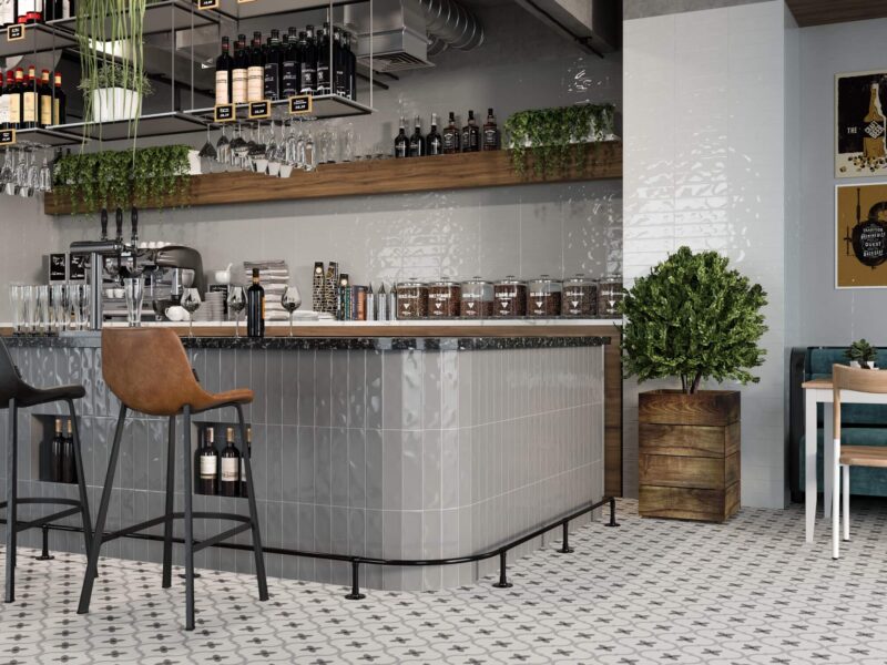
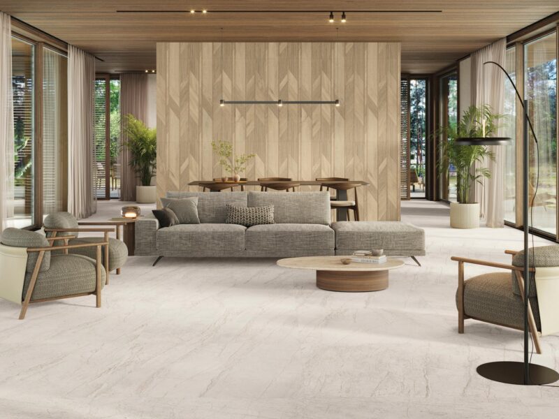
Neutrals are getting warmer and warmer, with options such as peaches, corals, and light clays. The gauged porcelain tile panels/slabs and pavers pictured above seem to be a perfect combination of this warming trend.
Neutral Greens
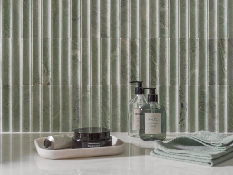
Nature’s neutral, green ceramic tile is available in all of nature’s green neutral shades.
Green is the next new neutral on our list, and we’re not alone: In a 2020 Sherwin-Williams survey of 250 professional interior designers, 44% of those polled identified sage green as a new neutral tone.
Other ideal neutral green shades include dark olive and muted pastel greens, such as the three-dimensional tile pictured above.
Back to Beige
Beige may not exactly be a new neutral, but it’s coming back into style in full force.
Gray supplanted beige as the favorite neutral for a time, but now beige is making a comeback. When using beige tile in your home, we recommend adding an interesting twist, such as choosing beige with a pink undertone or adding texture, such as the fabric-look beige tile above.
Blush Pink
Blush pink is a more elegant alternative to beige, as shown in this sophisticated pink and pale gray ceramic tile feature wall.
A more adventurous alternative to choosing beige with pink undertones is to go full-on pink: blush pink.
Blush pink provides the warmth of beige and coordinates well with cooler complements, such as gray and even black.
Gray Meets Taupe
Is taupe tile replacing gray tile as a top neutral tile choice?
We’re not ready to say goodbye to gray as a neutral altogether (in fact, gray is one of Pantone’s 2021 colors of the year), but we’re seeing more and more taupe rather than traditional gray. Just look at this gorgeous taupe bathroom tile accented with pink grout above.
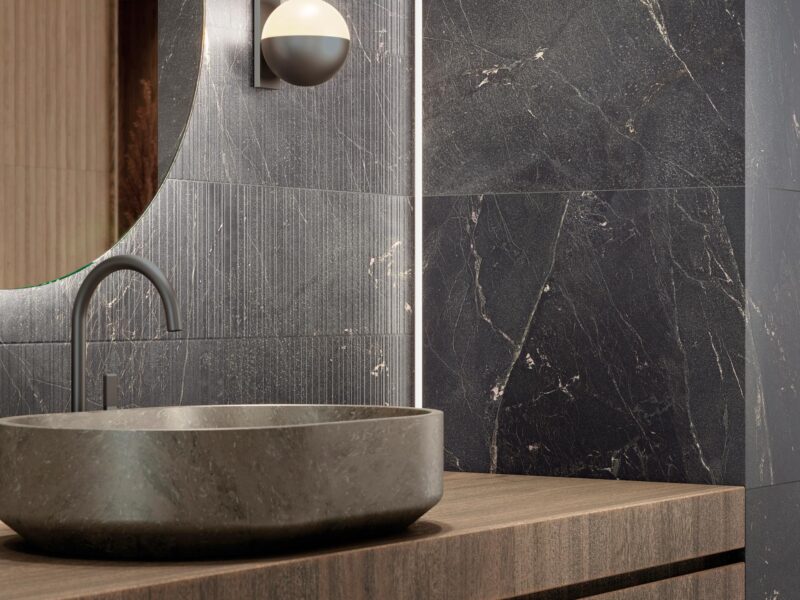
Black
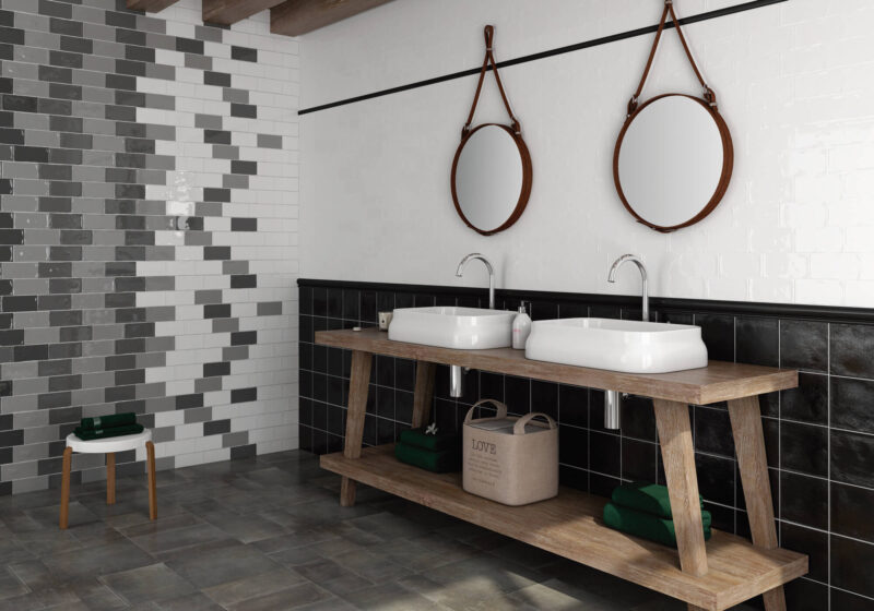
Pair the oldest neutral (white) with the newest (black) for a classic tile color combination.
Sixty-six percent of designers polled by Sherwin-Williams considered black to be a new neutral tone. Black tile can be dramatic, moody, or even understated, and provides that all-important backdrop for just about all accent colors. Pair black with bold reds and purples, calm pastels such as pink, and white for a classic black and white color combo.
Navy Blue
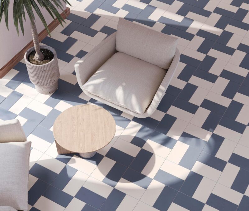
Like your favorite pair of jeans, navy blue tile looks great with just about everything.
Navy blue is a regal hue that is incredibly versatile for grounding more vibrant tones yet also right at home with other neutrals (as in the photo above).
Biophilic Neutrals

Variegation and a slight texture give this neutral bathroom tile a unique and natural look.
A common thread among neutral greens and warmer neutrals is the growing trend of biophilic design, or interior design that helps us connect with nature. Ceramic tile, specifically, manifests biophilic design through neutral color designs with variegation, neutral natural looks such as stone or wood, and textures that achieve a truly organic look and feel.
Wood Looks
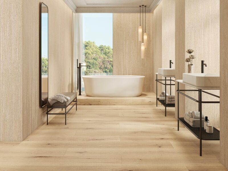
Wood-look tile is a great alternative to solid beiges, browns, and grays.
Perfect for flooring, walls, countertops, and more, wood-look tile can serve as a neutral color in any space. Those thinking of using shades such as beiges, browns, and grays as a neutral can swap them out for wood-look tile in a similar tone for even more visual interest.
Stone Looks
Stone-look tile is a popular choice for creating a neutral look.
Whether you go with a white, cream, gray, black, or a more unique hue, you can’t go wrong with stone-look tile as a neutral. This cream stone-look fireplace surround is a case in point.
Marble Looks
Marble-look tile is a classic choice for a neutral wall covering.
Marble-look tile combines the seemingly opposite tasks of creating a neutral look and a dramatic effect. Choose between light marble looks in grays, creams, and whites and darker hues such as the one above.


